My Favorite Graphs: Driving Safety, In Fits and Starts
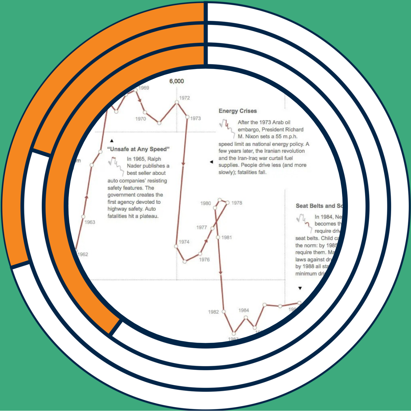
In this My Favorite Graphs episode, I revisit Hannah Fairfield’s 2012 New York Times graphic, Driving Safety, in Fits and Starts. I explain how its connected scatter plot pairs vehicle miles driven per capita with auto fatalities per 100,000 people, connecting each year to reveal changes over time. I walk through the chart’s shifts and loops, including the energy crises of the 1970s. I discuss why connected scatter plots can be difficult to read and what makes this example work so well. Most of all, I highlight how Fairfield combines the story, annotations, and miniature highlighted charts to explain both the data and how to read the graphic. Please note, I mistakenly said the live podcast at Cluster is on Thursday, but it's actually on Wednesday, November 11! I hope you can join me! Chart: Driving Safety, in Fits and Starts Subscribe to this podcast. Follow this show and everything dataviz on Instagram, LinkedIn, Substack, X, and YouTube. Check out the PolicyViz website to learn more about data and data visualization. Questions? Comments? Pitch ideas? Email me at: jon@policyviz.com Hosted by Zencastr where you can record, transcribe, edit, and automatically publish your meetings, podcasts, and more.