Skip to content
Artwork for LessWrong (30+ Karma)
LessWrong (30+ Karma) · Yesterday · 5 min

“Slower Animated Diagrams” by XelaP

TL;DR: SLOW DOWN YOUR DAMN ANIMATED DIAGRAMS. Every critical stage of the animation should a clear view that stays for at least 1 second, and 2 if it's intricate Diamond's strong because of its crystal structure (I think). What's the crystal structure look like, anyway? Let's look at the Wikipedia page! There's a nifty little animation: And it SUCKS. It's TOO FAST. Why are they rotating SO MUCH SO QUICKLY, with MOST of the time spent at TERRIBLE ANGLES where you CAN'T EVEN SEE ALL THE ATOMS. And the lines are THICK, WHYYY. It wasn't always this way. In 2017 the page had this animation: It's not perfect but it's much better. Thinner bond lines means it's easier to see the atoms. About half the time you get a clear view of all the atoms (you want to spend some time showing how they overlap from the right angles). The camera isn't swiveling fast all the time, so you get stretches of time that view the structure from about the same angle. Why do they use the new one? This certainly isn't the only time I've been frustrated by how fast explanatory animations move. I suspect it's because people [...] The original text contained 2 footnotes which were omitted from this narration. --- First published: October 24th, 2026 Source: https://www.lesswrong.com/posts/ZiCvwLKreShtXuyiB/slower-animated-diagrams --- Narrated by TYPE III AUDIO. --- Images from the article: Apple Podcasts and Spotify do not show images in the episode description. Try Pocket Casts, or another podcast app.
0:00-5:58

transcript

No transcript — this publisher did not publish one.

show notes

TL;DR: SLOW DOWN YOUR DAMN ANIMATED DIAGRAMS. Every critical stage of the animation should a clear view that stays for at least 1 second, and 2 if it's intricate

Diamond's strong because of its crystal structure (I think). What's the crystal structure look like, anyway?

Let's look at the Wikipedia page! There's a nifty little animation:

And it SUCKS. It's TOO FAST. Why are they rotating SO MUCH SO QUICKLY, with MOST of the time spent at TERRIBLE ANGLES where you CAN'T EVEN SEE ALL THE ATOMS. And the lines are THICK, WHYYY.

It wasn't always this way. In 2017 the page had this animation:

It's not perfect but it's much better. Thinner bond lines means it's easier to see the atoms. About half the time you get a clear view of all the atoms (you want to spend some time showing how they overlap from the right angles). The camera isn't swiveling fast all the time, so you get stretches of time that view the structure from about the same angle.

Why do they use the new one? This certainly isn't the only time I've been frustrated by how fast explanatory animations move. I suspect it's because people [...]

The original text contained 2 footnotes which were omitted from this narration.

---

First published:
October 24th, 2026

Source:
https://www.lesswrong.com/posts/ZiCvwLKreShtXuyiB/slower-animated-diagrams

---

Narrated by TYPE III AUDIO.

---

Images from the article:

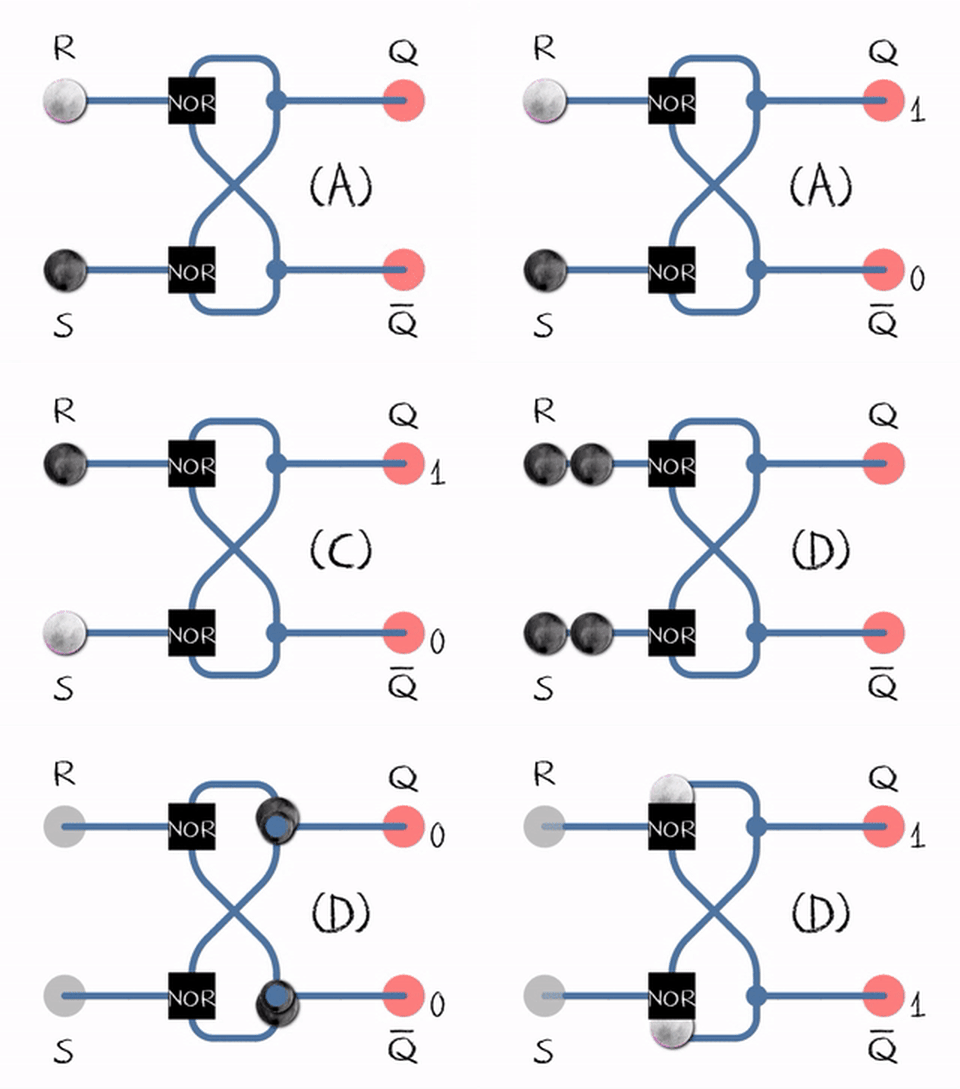
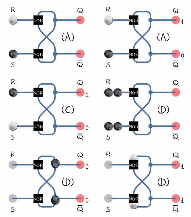
SR latch
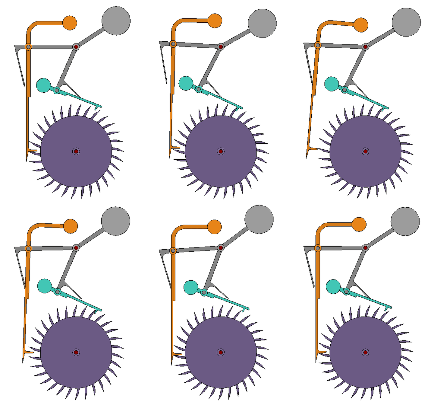
Grasshopper escapement, which I read about in the book Longitude. The book's diagrams were worse.
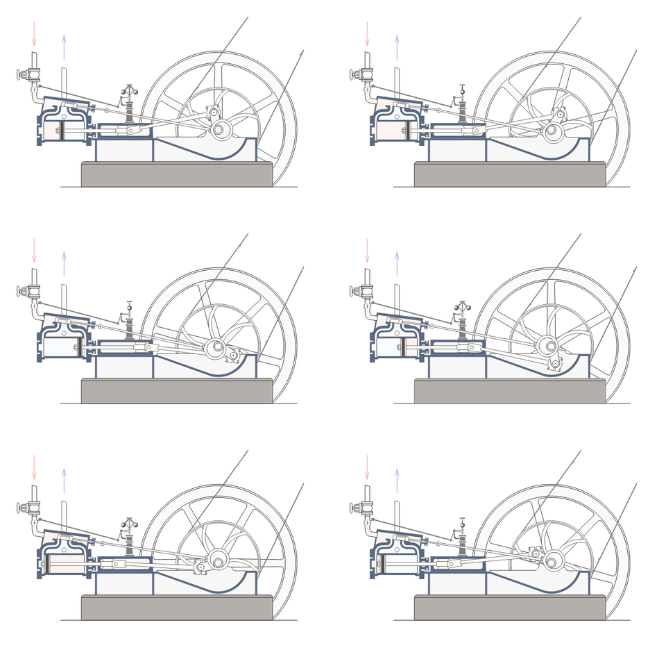
Reciprocating double action steam engine. __T3A_FOOTNOTE_REMOVED__
Four-stroke internal combustion engine
Geneva drive, as featured on the page on Gears


SR latch circuit diagram using two cross-coupled NOR gates.
Mechanical escapement diagram with purple gear and colored levers.
Diagram of a horizontal steam engine with flywheel.

Apple Podcasts and Spotify do not show images in the episode description. Try Pocket Casts, or another podcast app.

links13